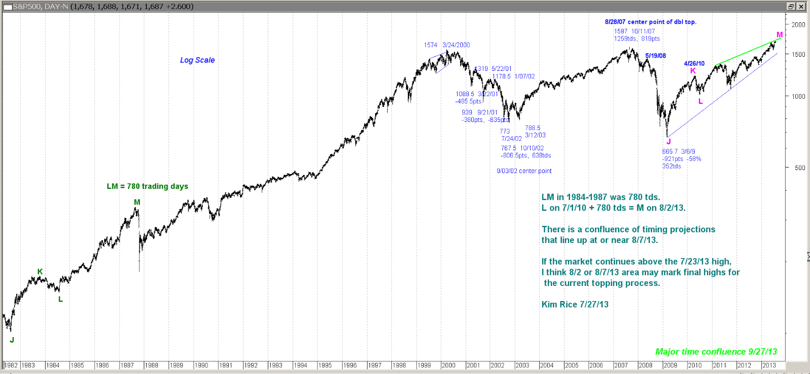
Sunday, September 8, 2013

Megaphone Patterns


I've seen a number of posts by technicians pointing out that the next resistance on the Dow Industrials is around 16,000 where the upper trendline is. Some of those posts then speculate the market will launch through the trendline after a modest correction.


Well, I would point out that the ETF for the DOW 30 has already hit the upper trendline.


I would also point out that the last major megaphone pattern was back in the 1966 to 1973 period. In the S&P, the market never made it to the upper trendline. After the 1973 peak, the market melted down into the 1974 low and took out prior swing lows of the pattern in the process.


There are no guarantees when forecasting market movements, but the weight of the evidence I'm looking at (and have posted over the last few months) suggests we follow the path after the 1966-73 megaphone pattern.

Kim Rice 9/8/13

Sunday, August 25, 2013

Stocks Long Term Inflation Adjusted Chart


I came across a very long-term inflation-adjusted chart of stocks posted by Doug Short on the Advisor Perspectives website. Doug's research and charts are pretty much based on fundamental economic data. Since the data I have only goes back to 1900, I thought I would do some analysis on this chart because it shows a major swing low in 1877. What I found appears to be supportive to my on-going long-term analysis projecting 2013 as a major timing point for change in trend. The duration of 1877 to 1929 is 52 years. If you expand that duration by 1.618 it results in 84.136 years, added to 1929 = 2013. You can see this graphically with the Fibonacci time grid I've added to the chart.

The second chart shows margin debt, which I also found posted by Doug on Advisor Perspectives site. I think it requires more conviction to load up on margin than it does to vote one way or another in a weekly poll. Therefore it would seem more instructive as to sentiment than some of the surveys with manic swings from bullish to bearish each week.

Kim Rice 8/25/13


Sunday, August 18, 2013

Is the Top In on Stocks? Probably.

Posted below are a number of charts with annotations and analysis to follow-up on recent posts regarding the major long-term price and time projections that the DJI and SP ran into over the last week or so. You may want to review recent posts to see the major long-term geometric projections in the SP that, so far, have marked the top.

The first chart updates the timing projections from 1932, 1982, 1987, and 2009. One thing not annotated on the chart is that this web of timing also ties into a major top from 1796. As noted earlier, 8/10/13 is 1618 cal days from the 3/6/2009 low, and 8/12/13 is 1618 weeks from the 8/09/1982 low (which is 7 x 1618 days). The next expansion in time backwards would be 7 x 1618 weeks, which projects to 1796. I don't have charts back that far, but 1796 was the top of a bubble and start of the Panic of 1796-1797. Legislation enacted on 2/25/1797 kicked of an acceleration of the panic. If we rhyme with that period, late Feb to early Mar 2014 may kick off a panic wave down. That timing correlates with a confluence of a lot of projections which I will post in a future blog. In any case, a wave 2 rally into next Feb/Mar period might not end well.

Kim Rice 8/18/13


Sunday, August 4, 2013

Stocks: More Projections and Few Timing Corrections


Timing Projections
After rechecking the numbers for some of the timing projections for 8/7/13, I found a few items that were off a bit:

> The low on 3/6/2009 was a Friday. When double-checking the date projection using Excel Spreadsheet, 1618 cal days from 3/6/09 is Saturday 8/10/13. This had showed up as 8/7/13 when measuring time using Prophet Charts, which was incorrect.

> The low on 8/09/1982 was a Monday. I double-checked the math and 1618 wks = 11,326 cal days. 8/9/82 plus 11,326 cds = Monday 8/12/13 (using Excel Spreadsheet). So the exact day for 1,618 weeks from the 1982 low is 8/12/13.

> The projection from the 10/20/1987 crash low, adding 3 x pi (or 3141x3 = 9423) does project to 8/7/13. However, if you include the next number in pi (i.e., instead of 3141, use 31415), that projects to Friday 8/09/13.

> In the previous blog post, the 780 trading-day symmetry with 1987 pointed to 8/7/13 based on counting from 7/01/2010 low. However, in the DJIA futures, the low was 10/06/10, so 780 tds from that date projects to 8/12/13. This is probably the most speculative of the projections, but it's usually important to look for time symmetries with prior legs.

The 3253 trading-day time square from 10/20/1987 low to the 9/1/2000 top does project to 8/7/13. So, with the above corrections, there are three major time projections pointing to Friday, Saturday and Monday 8/9, 8/10, and 8/12/2013, and one projection to 8/7/13.

A few additional timing projections to this time window include the following:
> Using the date to calendar days timing method, 7/02/2010 low plus 702 cal days = Sunday 8/11/13.

> Friday 7/8/1932 low to 8/12/2013 = 29,620 cal days, which is 4,231 weeks. 1.618 x 2.618 = 4.235924. So 8/12/13 is 1618 wks from 8/09/1982 and 1618 x 2.618 from 7/08/1932 (roughly). The exact projection of 4,235.924 weeks from 7/08/1932 is 9/13/13, which may mark a double top, higher top, lower top, or nothing at all.

Price Projections
Posted below is a long-term SP chart showing a massive measured move where the leg from 1974 to the low 1700s on the cash SP is the same length in percentage terms as the leg from 1932 to the 1973 top.


The next chart shows a traditional Gann method of squaring a price range. In this case the low 1700s in the cash SP is two squares (in percentage terms) up from the 1929 to 1932 range.


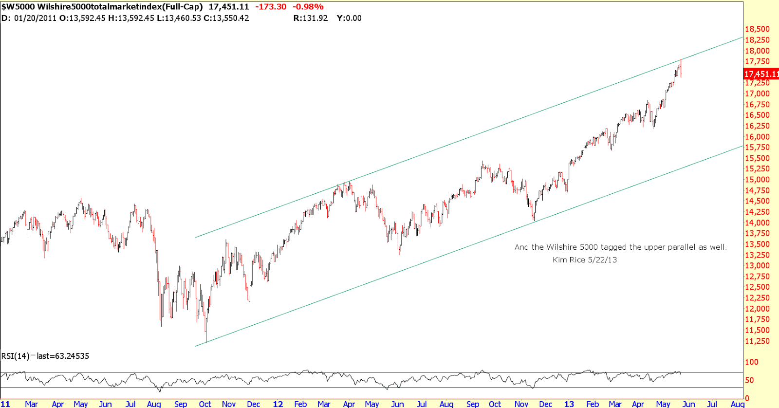
The chart below shows the SP cash has the same 1.272 price projection symmetry as the DJIA shown in the previous blog post.


Some nearer-term projections on the cash SP chart below line up at approximately 1721.5 area, so 1716 to 1722 should mark a potential turn, presumably an important top.


As posted some months ago, there is still a confluence of projections on the cash DJIA to the 15,875 to 15,925 area. If we sail above the 15,760 are shown in the previous blog post (multiple 1.272 projections), I would expect the 15,900 area to be important.


Of course the markets can do anything, and these points may be just resistance areas along the way to much higher prices into some important time projections due in the Spring of 2014. I think if the DJIA ever gets above 16,600, it will likely mean it is going much higher. For example, I have one projection to 25,000 area and another method points to 31,000 area. I don't expect either of these to happen, but anything is possible with the World wide quantitative counterfeiting program still underway.

Kim Rice 8/4/13

Monday, July 29, 2013

Stocks: Divergences, Price Projections, and Major Time Confluence around 8/7/13

So far, the market peaked exactly on the Fib timing projected for 7/23/13 area based on the long-term swing points posted here in the most recent blog entry.

Below are a few charts showing some significant divergences that frequently precede market reversals:


Here's a chart showing a possible timing analog between the 780 trading day rally that peaked in 1987 and the current rally from 7/01/10 that will equal 780 trading days on 8/2/13.


The next chart shows a possible 1.272 projection confluence around 15,760 on the DJI, which would have symmetry with the 2002 to 2007 1.272 expansion.


Lastly, the next chart shows a major confluence of daily, weekly and monthly timing projections that point to the week of 8/9/13, with all daily projections pointing to 8/7/13. I think 8/7/13 area could either mark the final top, a lower high before a meltdown, or a crash low.

Kim Rice

Monday, July 15, 2013

Long-Term Time Geometry in Stocks

There are two set of major long-term swing points in stocks that project to a fairly narrow time window of 7/17/13 to 7/23/13 for a possible change in trend. The projections on the charts posted below are both based on calendar-day counts. Time projections based on trading-day counts are sometimes more accurate, but I don't have data that will calculate trading-day counts going back to 1932. If the trading-day count turns out to be the valid count for theses projections, I would estimate they would point to a window in mid August for the potential CIT.

The third chart shows a long-term moving average of the TRIN indicator which I uploaded a few days ago. It showed the market to be quite overbought and in an area where this indicator sometimes marks important highs in stocks. In the last few days this indicator has stayed about the same to slightly more overbought. At the very least, the TRIN is not in an area that historically has marked major lows before multi-month advances.

Kim Rice 7/15/13

Wednesday, May 22, 2013

Stock Indices Hit Important Resistance

Posted below is a series of charts that show perfect hits and reversals at important trendline/channel resistance. Per the previous post, I would expect a retest of highs or lower top on or near 6/7/13 before the expected larger down move gets underway.

Sentiment-wise, here's a post I found on someone's blog last week:

"what are the chances of this market going down??? how about Z-E-R-O???"

Kim Rice 5/22/13